2005 US Income Distribution

by Catherine Mulbrandon

in Distribution of Income, VE Infographics

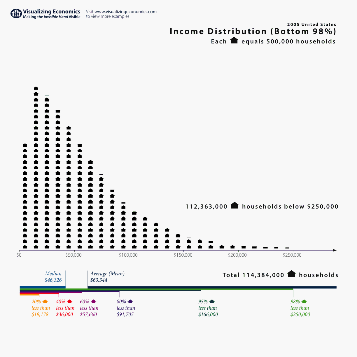
More Census data! This time it is the U.S. income distribution for 2005 showing the number of households up to $250,000. (I have since added more graphs that include incomes above $250,000: 2005 US Income Distribution Part 2 and 2005 US Income Distribution Part 3)

{Click on the graph to take a closer look}
US Income Distribution 2005 magnifying glass

While the original Census data can be found in U.S. Census Bureau’s Current Population Survey Table HINC-06. Income Distribution to $250,000 or More for Households I needed to calculate the number of households in $10,000 increments for this graph. (That calculation can be found here: Census household income distribution. Besides the income distribution for 2005, I added 2004 as a bonus. It can be viewed by anyone with a Google Account.)
See Also: 2005 US Income Distribution Part 2 and 2005 US Income Distribution Part 3 for graphs of the rich and super rich. And United States’ Average Income since 1913 both with and without capital gains.
Addendum:
11/19/2006 Added upper limits of income quintiles and the median from Table H-1. Income Limits for Each Fifth and Top 5 Percent of Households
[tags]US Income Distribution, Income Distribution, Census Income Distribution[/tags]

Post Revisions:

There are no revisions for this post.

  • Pingback: Economic Eras in Modern U.S. History « we xo you

  • http://www.wealthencyclopedia.com Chris Johnson

    nice, but 2 ways to improve:

    1) It would be helpful if you drew the vertical and labeled it – nobody wants to count those little houses and then multiply by 500K.

    2) little houses should be drawn only on the graph, and where it explains that each house represents 500 k housholds.
    Do not dra it next to total household count and next to count of households below 250k – it confuses the reader.

  • Andy

    Now what would be really interesting is to get an income distribution change over time, like your average income over time graph.

  • David Kerlick

    Have you considered Ben Schneiderman’s (U of MD)
    “Tree Maps?” It’s a way of plotting how much
    of the pie each percentile gets. Hint, half of the graph is taken up by 1 percentile, and the other boxes are scrunched…

  • Pingback: US Income distribution « Hawthorne Effect

  • Pingback: igudo » Are you (relatively) rich?

  • Mark R

    Im taking your data at face value but the graph on your other page showing average income to the early 1900s being over 10000 doesnt seem practically right. I graduated in 1977 with a degree and a cpa certificate and my annual salary was 15,000 Assuming your data is numerically correct, the top wage earners wouldnt seem to be enough to skew it so I suspect the denominator is suspect however defined

  • Al Maurer

    Nice graphs! I especially like the percentile scores at the bottom of the graph. Are you a fan of Edward Tufte?

  • Catherine

    Yes, I have Tufte’s books but I liked his presentation better. I think he is able to explain his ideas more clearly when he presents them himself.

  • mgear

    Mark R: The dollars on the graph you refer to are 2004 dollars, meaning they are adjusted for inflation. They are probably correct. Your $15,000 1977 salary is much more than $15,000 in 2004 dollars.

  • Barry

    Household income skews reality a little when people figure out that often “households” with only one person or wage earner in it make less than households with several.

    Some of the smaller households are doing just as well per capita as those with twice as many people and twice the income.

    The “income” above almost certainly include the value of government transfer payments, such as earned income credit, medicaid or medicare, food stamps, section 8 housing, etc.

    The chart is less skewed, when we take income “after taxes” into account.

  • Barry

    I meant to say the income noted above excluded the transfer payments.

  • Pingback: Credit Contraction Thoughts (and a question for you) | VirusHead

  • Yury

    I would really like to know how the $2,500 increment data was obtained for incomes above $100,000. Your Google spreadsheet mentions only the usual US census data as its source, but their data bins are $50,000 above $100,000. Did you have other sources?

  • Pingback: If economics is presented as a "social science" why is it saturated with boring graphs, equations, charts? | Open Social Blueprint

  • Deborah

    Great graph. I’d love to use it in a statistics course I teach, but the font for the horizontal axis is too light. It’s not visible in Power Point. It would be great if all the labels were in darker fonts.

  • http://chasingmytail.net Andy B.

    Thank you! I’m an economics layman and your graphs always address my curiosities clearly and concisely. Please keep up the good work!

  • Dismayed

    I’d love to see a plot of household income for the entire world. We sometimes forget how lucky we are.

  • http://happysealamb.blogspot.com Yang

    One thing to note, though, is that you are not including the very long tail that goes out on the high end. I know that this data is not included in the census, but I think the resulting chart is very misleading.

  • http://none Jeff Fiddler

    Fantastic Chart….I just wrote up a review for Robert Whapples course for the Teaching Company on Modern Economic Issues. I don’t give a hoot about minor fudges in your chart. Transefer payments and single incomes are a drop in the bucket. I want everyone to see the disaster we are in. Have you updated this for 2010? It’s like the census and statistics will not show the gross inequality of our country’s economy and how it’s getting worse…

    I love the description called the L curve…..where 99 percent of us are on the base and 1 percent are on the upright….

  • Pingback: Notable readings of the day 09/29/2010 « Pro Bozo Publico

  • Pingback: Eat The Rich : : Electric Monkey Pants

  • Derick

    i make somewhere around 1800 to 2500 a month depending on overtime. regularly i make 12.50 an hour which on a 40 hour week is 500 but that is before taxes.. I have a wife (doesnt work) and two kids.. which class would i fall under. Lower or middle

  • Prof.K.Prabhakar

    It is really useful for teachers. Is it possible to show data from 1930′s. Thanks.

  • Pingback: 2005 US Income Distribution – インフォグラフィックス

  • Pingback: Well, this is terrifying | The Stay-at-Home Feminist Mom

  • Pingback: good job, religious right! - Page 3

  • Pingback: “2005 US Income Distribution” — Catherine Mulbrandon « Supporting the 99%

  • http://pulse.yahoo.com/_EDPH7EOG5DEYIWTJK2HTHBHN5I Carl Von Snarl

    NO DOUBT.  And what about “after subsidies”?  Of course, all the liberal twits never take a moment to consider household, size, taxes, subsidies, etc. – they just rush to congratulate themselves about how right they’ve always been about how terribly inequitable things are and how we can fix it all with redistribution.

  • Pingback: Imobiliare - Page 1435

  • Pingback: Where does rich Americans' wealth come from? - Quora

Previous post:

Next post: