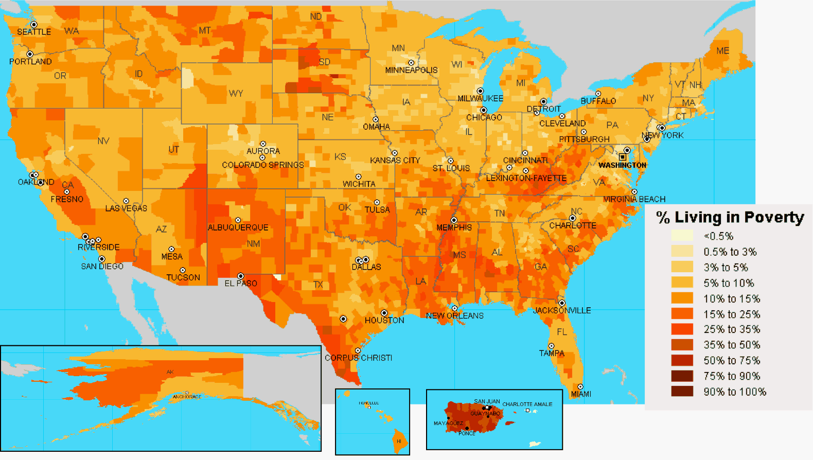
Another income map, this time plotting the % of people living in poverty based on the 2000 Census. If you would like to see a more detailed version go to Social Explorer and choose "Poverty" from the second drop down, then select the magnifying glass to zoom in on a specific county.
See also: United States Household Income Map United States Income Inequality Map
Addendum: 8/19/2007 I added Alaska, Hawaii, and Puerto Rico to the map.
