UPDATE 3/17/2010: I added more information about marginal tax rates by graphing the combined marginal tax rate line in the last graph. Also clarified that the employer-side of the payroll taxes are not included The first of series of infographics I am designing to illustrate the average federal tax rate applied to different salaries. I want to show how the marginal income tax rates + social security and medicare taxes combine together for a single taxpayer up to $400,000. (This graphic does not include payroll taxes paid by the employer.)
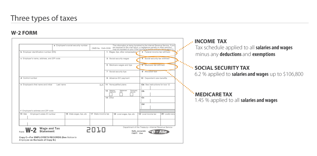
A little background about this data. If you take a look at your W-2 form you can see that there are 3 different taxes applied to salaries and wages:


