Mastodon

Federal Revenue and Top Tax Rates

USTaxRatesMainSources2015.png

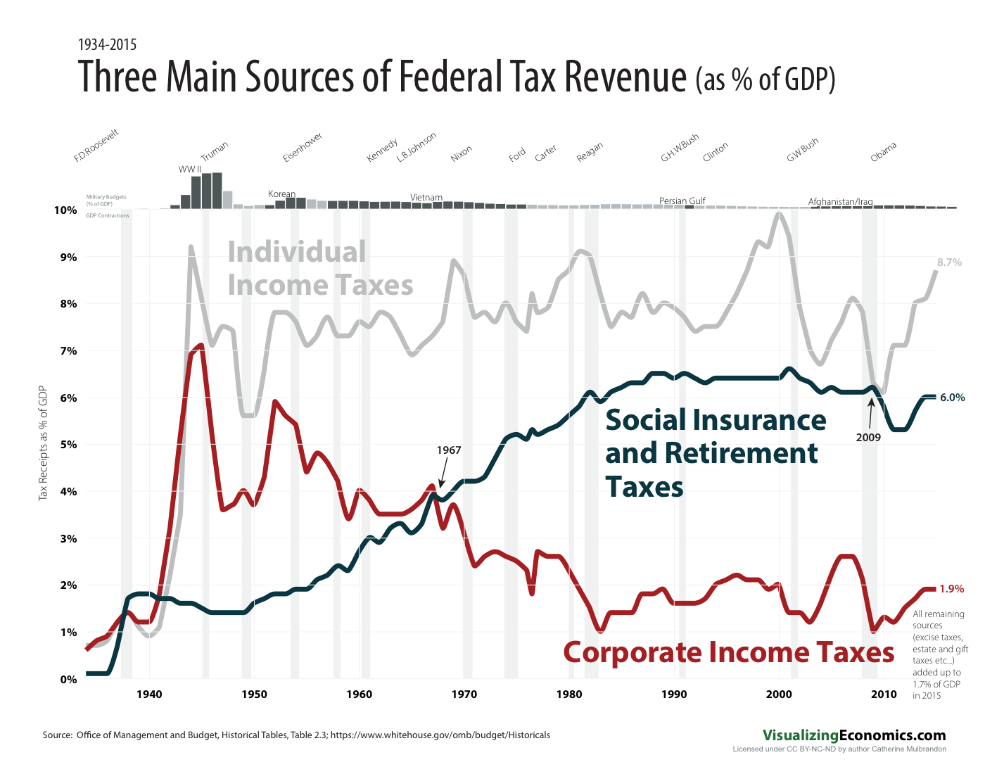
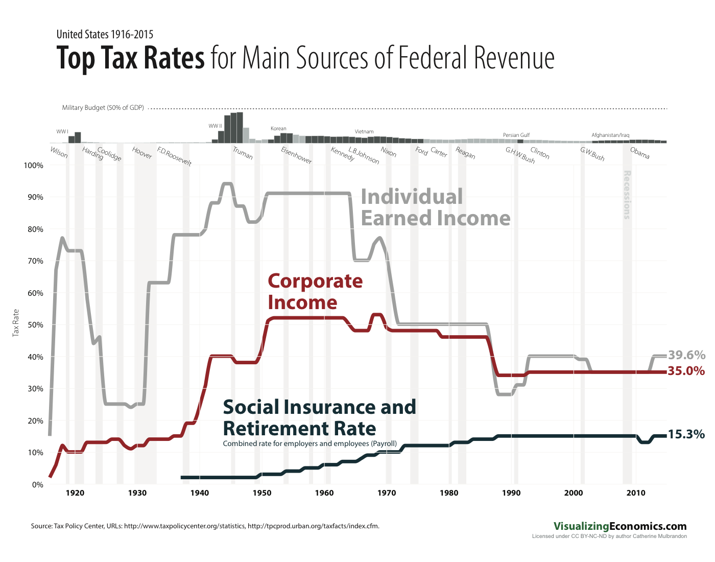
What caught my attention with this Federal revenue dataset was the reversal of the social insurance taxes and the corporate taxes in their relative importance to the Federal government. So what are the tax rates? I revisited my tax poster from a few years ago to make a companion graph about the highest tax rates but that is not the whole story. What is missing is who (and how many) actually paid these top rates. BTW, the individual and corporate rates are the top marginal rate, while the Social Insurance and Retirement tax is capped beyond which you don't pay any additional taxes (it was $118,500 in 2015).

Data from Office of Management and Budget, Historical Tables, Table 2.3, and from Tax Policy Center statistics and their tax fact site.


BTW, if you pledge on Patreon you will get access to high-resolution files and a sneak peek at my work.


Related Posts Plugin for WordPress, Blogger...

Land's Share of Home Prices | Long-term Interest Rate

Data Notes: Data is from the Lincoln Institute of Land Policy can be found here: CSW-based price index: aggregate land data, quarterly, 1975:1-2016:1. I took the "Aggregate market value of residential land" and calculated the percentage of the "Aggregate market value of homes" and plotted it yearly. Interest rates are from MeasuringWorth.com  

BTW, if you pledge on Patreon you will get access to high-resolution files and a sneek peek at my work .


Related Posts Plugin for WordPress, Blogger...

Land's Share of US Home Prices

Data Notes: I am using a new data set from the Lincoln Institute of Land Policy for this graph data can be found here: CSW-based price index: aggregate land data, quarterly, 1975:1-2016:1. I took the "Aggregate market value of residential land" and calculated the percentage of the "Aggregate market value of homes" and plotted it yearly, then compared it to the Real Housing. Price Index I have used in previous graphs from Robert Shiller's dataset

BTW, if you pledge on Patreon you will get access to high-resolution files and a sneaek peek at my work .

Related Posts Plugin for WordPress, Blogger...

Real Growth in US Housing Prices

Last week, I graphed this data on a log scale but here it is on a standard linear scale which emphasises the exponential growth of housing prices before inflation. This behavior, along with bubbles in the market, makes residential housing look like a better long-term investment than it is. While a house is often the largest "investment" most people will ever make it is often a form forced savings combined with a hedge against inflation and when inflation is high your house value will often increase while your mortgage does not. Enjoy

Data is originally from Robert Shiller's book Irrational Exuberance which is updated on his website

Related Posts Plugin for WordPress, Blogger...

Real Growth in US Housing Prices (Log Scale) 1890-2015

I am revising a graph from 2010 focusing on national housing prices back to 1890. Data is originally from Robert Shiller's book Irrational Exuberance and is updated on his website.   Exponential data like this often needs a log scale to show the changes across different decades, however, I am created a companion graph to show the same data on a linear scale. Look for it next week!

BTW, if you pledge on Patreon you will get a sneak peek about what I am working on.

Related Posts Plugin for WordPress, Blogger...