Mastodon

Income

Four Ways to Visualize US Income Inquality

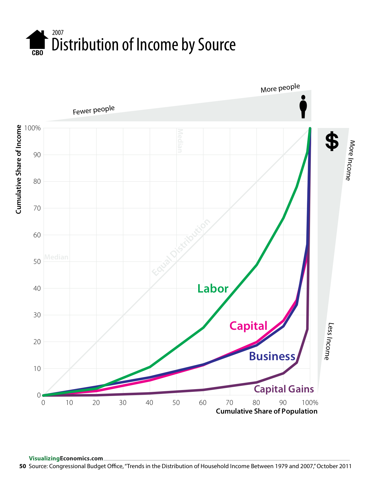
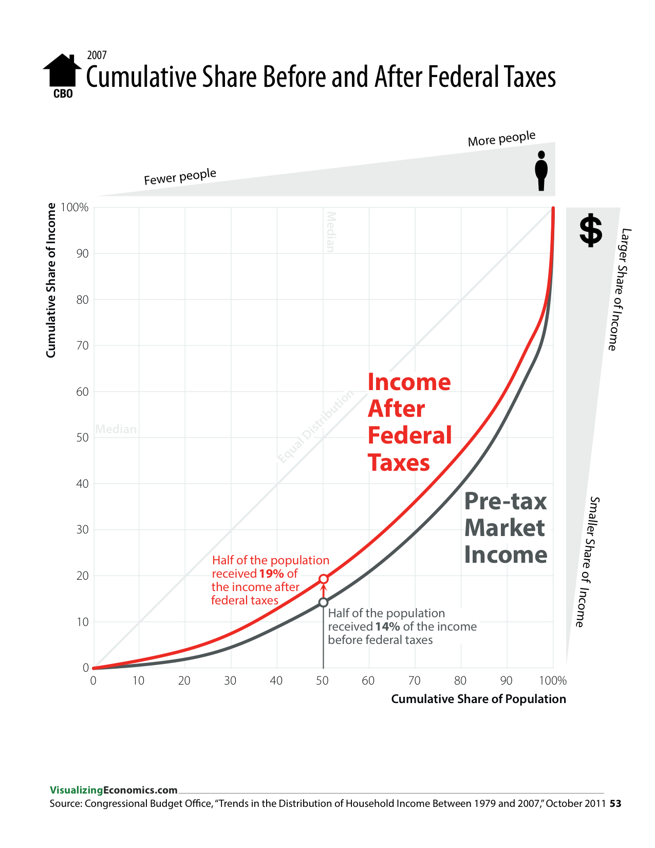
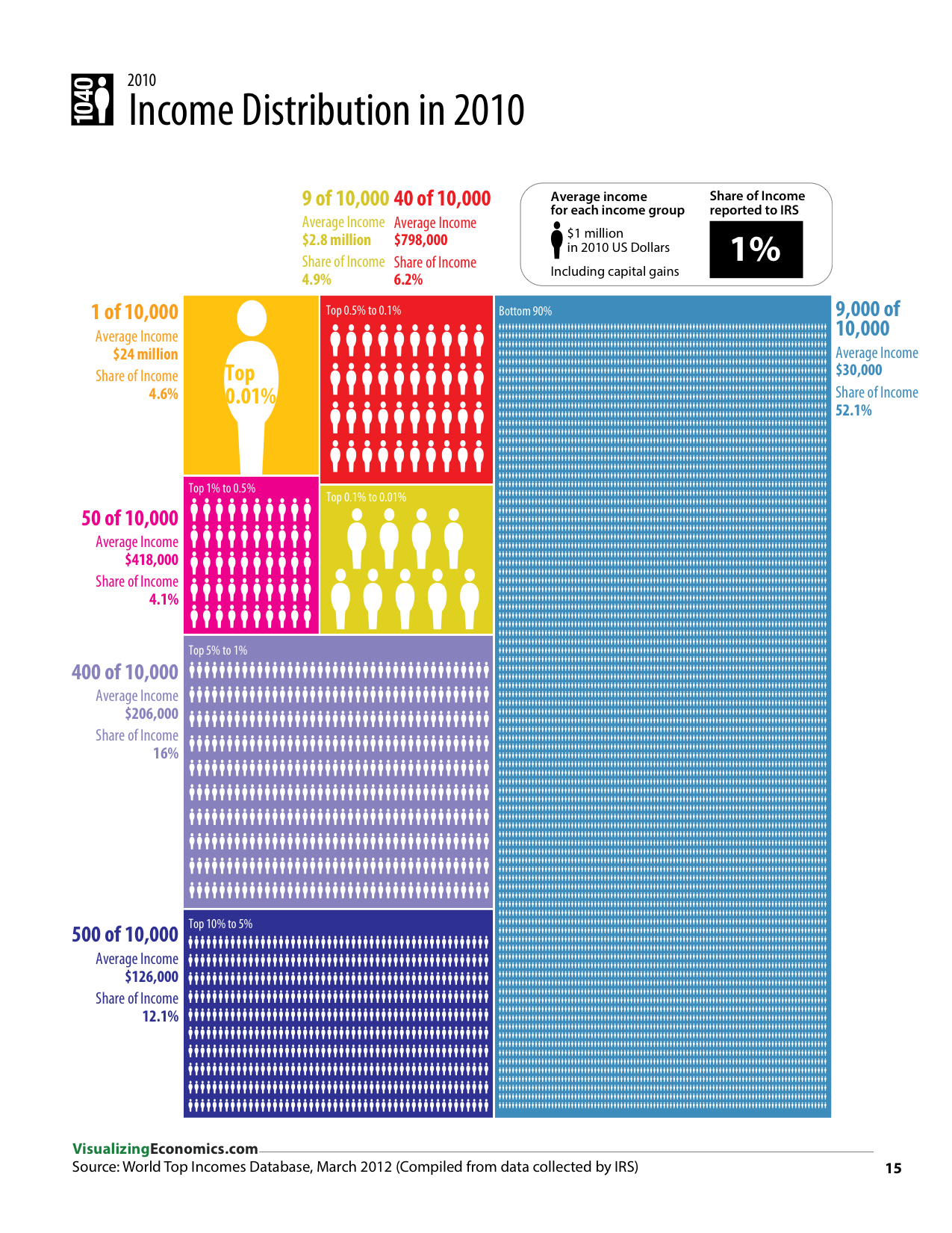
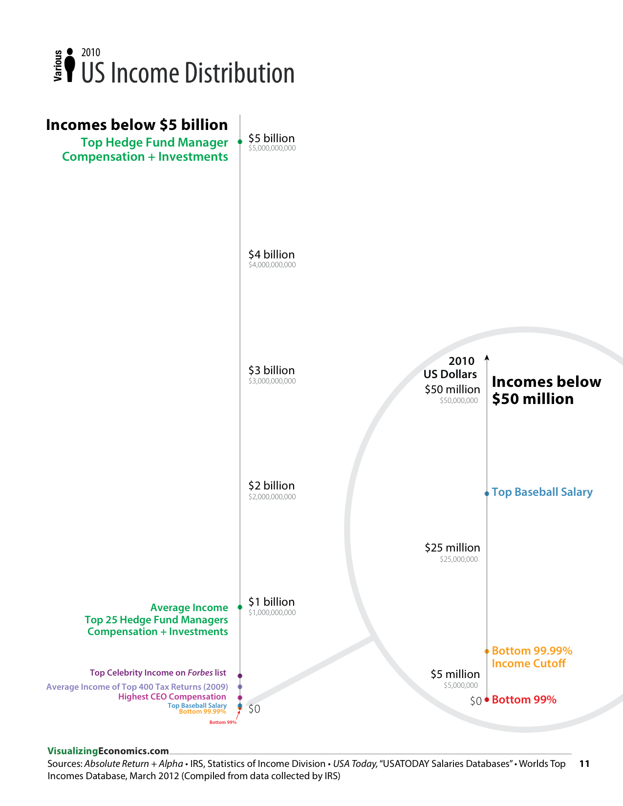
During the course of making my book, I tried to solve the problem of representing the extreme income inequality in the United States using several different graphic approaches. In some cases, I was working with a single data set like The World Top Incomes Database or the Congressional Budget Office. In others graphics, I combined this data with data from Forbes, IRS, and AR: Absolute Returns + Alpha.

Treemap was created using R and the people icons were added in Illustrator, while the cumulative share graphs and the dot plots were create in OmniGraphSkecher.


Related Posts Plugin for WordPress, Blogger...

Which households have incomes below $30,000?

From page 62 of An Illustrated Guide to Income in the United States. Looking at the demographics of households with less than $30,000 a year in income, it looks like a number of these households are headed by retired people.

  • 33% of these households are headed by someone over 65 year or over compared to the national avg of 21%

  • 60% of the time the householder (i.e.  person who owned, rented, or maintained the housing unit) did not work for pay in 2010

  • 47% are "Owner Occupied" i.e. the person who owns the home lives there.

  • 54% Are either living alone or living with a someone they are not related to.

Also households with incomes below $30,000 are more likely to be located in rural and urban areas than the national average.

Looking at the the poverty rate by county there are concentrations of very low income households (under $23,000 for a family of four) in places like Mississippi, Texas, and South Dakota.

To look at more graphics like these read my book online.

 Data from US Census Bureau, 2006–2010 American Community Survey 

Graphics made in OmniGraphSketcher and Adobe Illustrator using MA Publisher for the map. 

Related Posts Plugin for WordPress, Blogger...

What Has Happened to Middle-Income Households since 1945?

I dug up at the US Census Bureau serveral reports about family and individual income and created a series of graphs plotting the income distribution of households under $100,000 a year adjusted for inflation. (Pages 17, 18, 19 from my Income Guide)

I am defining middle-income households as $30,000-$80,000. One of the stories these graph tell is that for 20+ years after 1945 more households entered the "middle class". However, over the next 40 years, the percent of middle-income households shrank in part because the percent of households with more than $80,000 a year grew. 

IncomeGuide_2013_Jan17_RGB_page 17_17.png
IncomeGuide_2013_Jan17_RGB_page 18_18.png
IncomeGuide_2013_Jan17_RGB_page 19_19.png

Graphs created in OmniGraphSketcher and annotated in Illustrator. Data from the US Census. You take a look at some of the older reports they have online here: 

US Census Bureau. “Families and Individual Money Income in the United States: 1945. Table 2.” September 2011. http://www2.census.gov/prod2/popscan/p60-002.pdf.

———. “Income of Families and Persons in the United States: 1950. Table 1.” September 2011.  http://www2.census.gov/prod2/popscan/p60-009.pdf.

———. “Income of Families and Persons in the United States: 1960. Table 5.” September 2011.  http://www2.census.gov/prod2/popscan/p60-037.pdf.

———. “Income, Poverty, and Health Insurance Coverage in the United States: 2010. Table A-2.” September 2011. http://www.census.gov/prod/2011pubs/p60-239.pdf.


Related Posts Plugin for WordPress, Blogger...

Ten Years of Job Loss in the "Information" Industry

Let me begin with a disclaimer. This industry includes firms that are pure internet-based activities, like hosting and web searches as well as ones that are being disrupted by the internet like newspapers and broadcasting.

Information Industry's share of GDP 1947-2010 

Starting with the Information industry's share of GDP (from page 119 of my book), while it has grown over the last 50 years it is still around 4% of GDP as of 2010. 

However, the Information industry represents only 2% of the 170 million jobs in the US economy. 


In this treemap of all occupations in the US economy, each occupation is represented by a rectangle, the bigger it is the more jobs it has. Look at the upper right corner to see Information's share of jobs. The dark red represents the percentage of jobs loss and the only area more red than the Information sector is Manufacturing.

Now drilling into just the Information industry, some of the bigger occupations are: editors, computer software engineers, customer service representatives, telecommunications equipment installers, reporters and finally producers & directors. Out of that list only producers & directors had job growth between 2001-2011. 

If you are interested in the income of these occupations or want to explore additional industries take a look at my book

Data used in these graphics was based on BLS Occupational Handbook (provided by 
EMSIand value-added GDP from the BEA.  The area graph was created in Omnigraphsketcher and the treemaps by R. Label were later added using Illustrator.

Related Posts Plugin for WordPress, Blogger...

Government Salaries in Texas

From a very interesting database of Texas Government Employee Salaries run by The Texas Tribune, I created three data graphics for An Illustrated Guide of Income in the United States showing their distribution (pages 92–94).

I start with graphing the distribution of all public employee salaries below $250,000, 99.7% of all state employees, listing the most common job titles I found: teachers and professors, police officers, clerks and administrative assistants, bus operators, child protective services specialist and mental retardation assistants.

However, to graph the long tail of the income distribution I have to graph individual salaries. Many are heads of surgery departments and head coaches. The highest salary goes to the head football coach at the University of Texas at Austin. (Salary of $2.5 million plus a bonuses of $2.7 million for a total of $5.2 million)

Another way to show how much inequality exists with these salaries is to plot the cumulative share of Texas public employees vs cumulative share of their salaries. But how does this compare to the Untied States as a whole?  I found in a report from the CBO, a graph plotting the 2007 cumulative share of all US households against household income which I used as a stand in for everyone in the US. You can see that the US household income distribution is more unequal than salaries of Texas state employees.

Graphs created in OmniGraphSketcher and annotated in Illustrator. 

Data sources: The Texas Tribune and the Congressional Budget Office 

Design notes: Graphs were created using OmniGraphSketcher, copied into Adobe Illustrator where annotations were added. The illustrator file was then placed into an InDesign document for the book. View all the graphics from the book online.

Related Posts Plugin for WordPress, Blogger...