
Playing around Yahoo finance with a friend of mine (Hey Fleur!), we started looking at historical stock data. Yahoo has daily values for DJIA going back to 1929 so the obvious thing to do is look at the crash of 1929. Yahoo plotted the DJIA on a logarithmic scale because of the large change in values over the last 80 years:

We switched to the normal view:
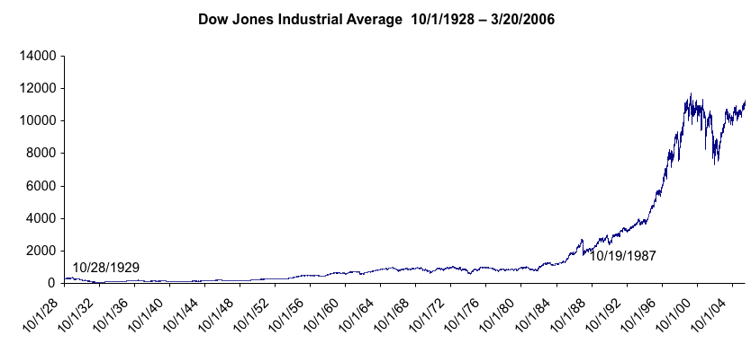
You can see why the log scale is needed. Without it the 1929 crash and the Great Depression are invisible. But what about 1987? Wasn't that the biggest drop in the history of the stock market?
October 28, 1929 “ Dow Jones plummets 38.33 to 260.64 (13% drop)
October 19, 1987 "Black Monday" Dow Jones down 508.32 to 1738.74 (22% drop)
In both of the above graphs we are plotting cumulative wealth (the current value is based on the previous day's value). What we need is the percent change day-by-day, which is why daily history at Yahoo is important:
