Mastodon

Congressional Budget Office

How much do federal taxes redistribute income?

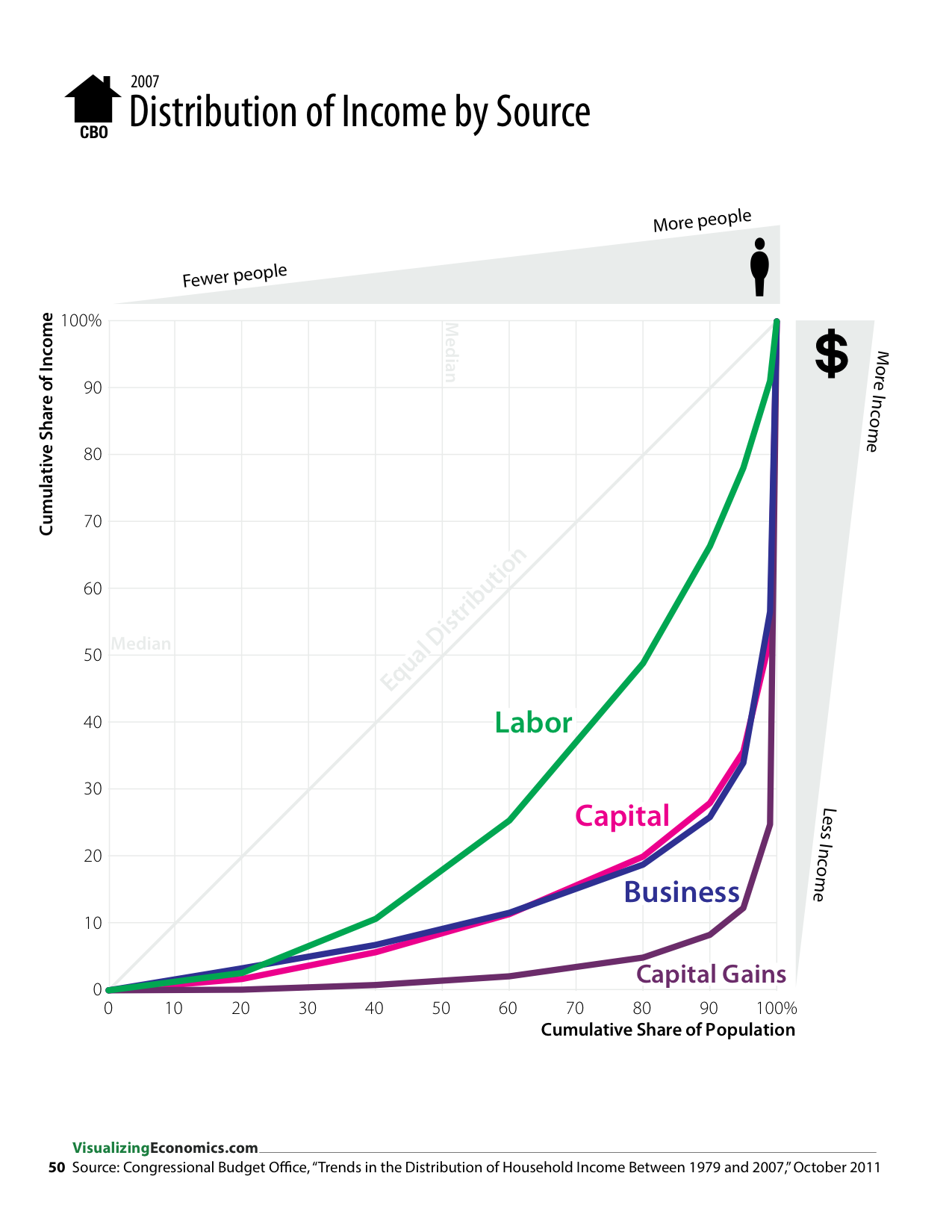
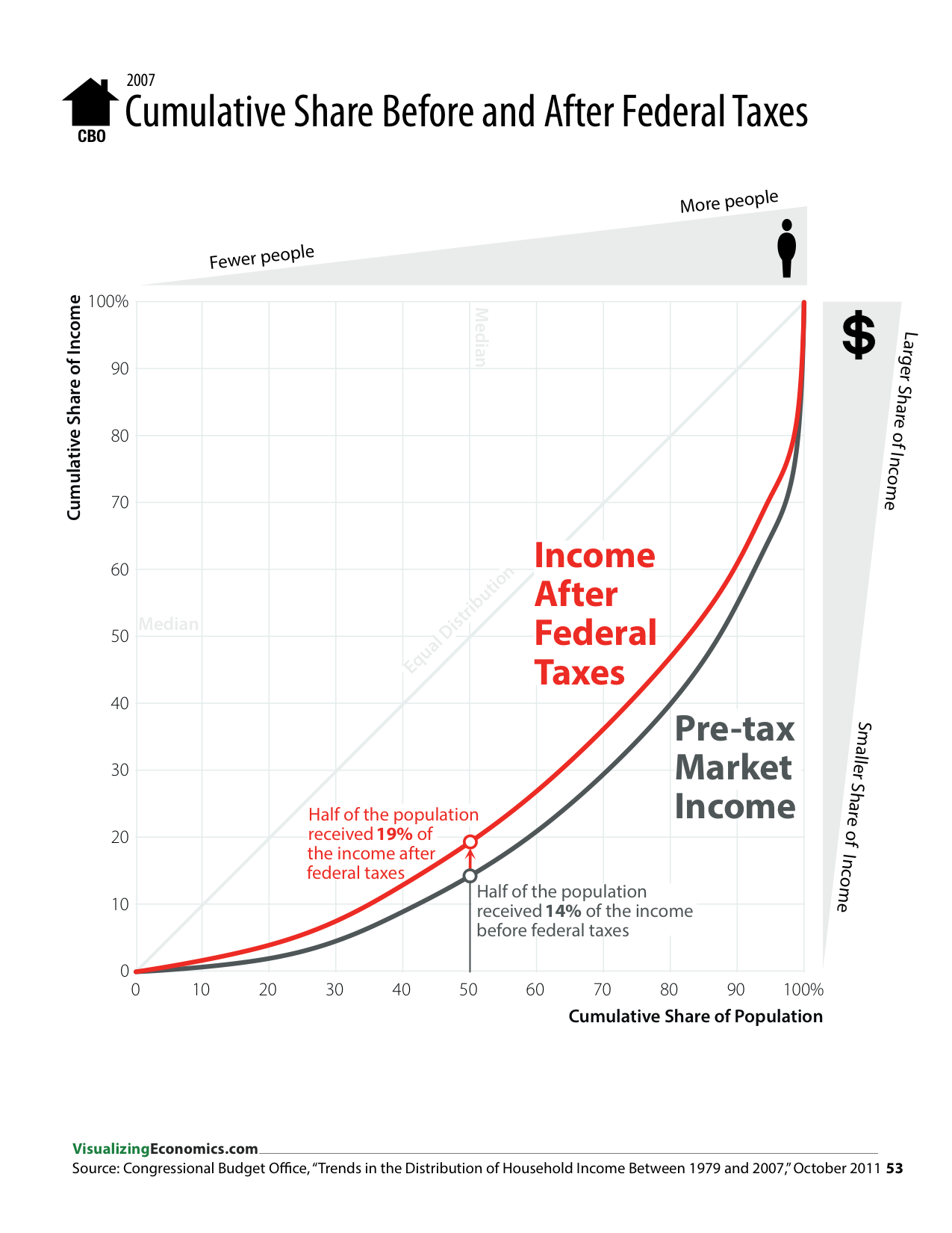
In the graph below, the closer the curve is to the gray, diagonal line the more equal the distribution. 


In the next couple of graphics, I focus on the effect on federal taxes on different income groups. 

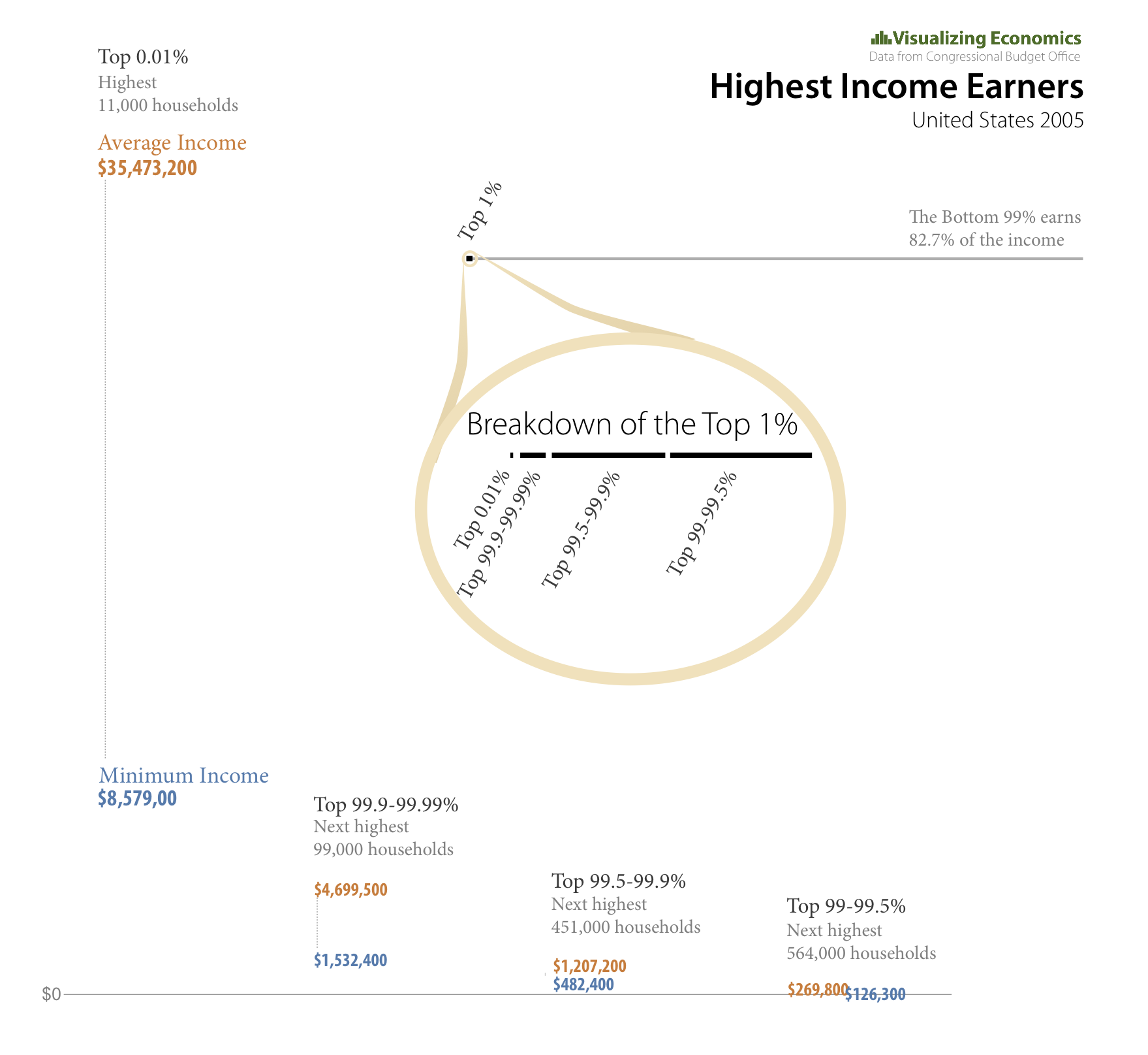
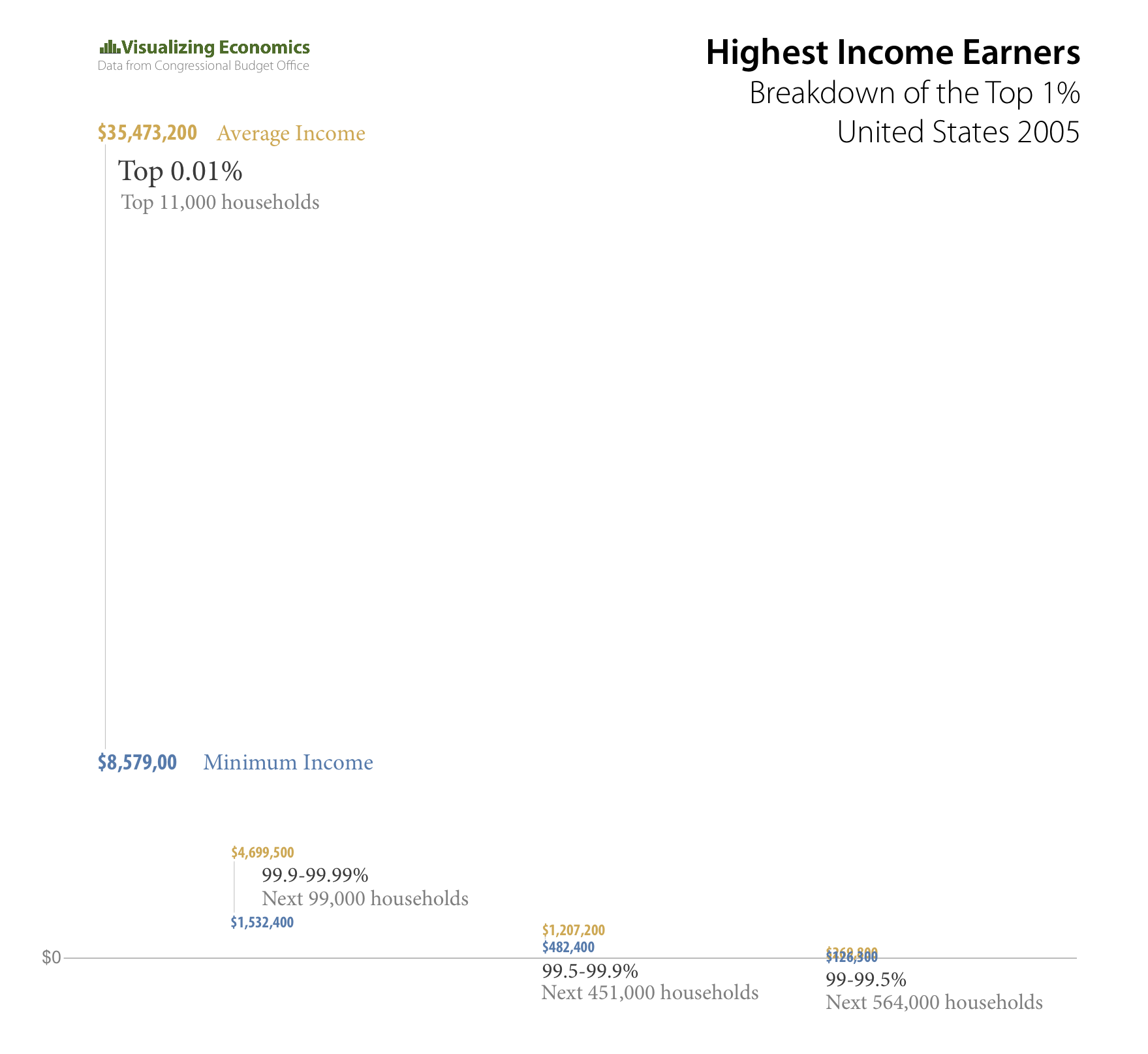
Graphics made in OmniGraphSketcher and Adobe Illustrator. Data from Congressional Budget Office. “Trends in the Distribution of Household Income Between 1979 and 2007.” Summer 2012. http://www.cbo.gov/publication/42729.  Congressional Budget Office. “The Distribution of Household Income and Federal Taxes, 2008 and 2009.” August 2012. http://www.cbo.gov/publication/43373

Take a look at more data visualizations from my book, An Illustrated Guide to Income in the United States.

Related Posts Plugin for WordPress, Blogger...

Four Ways to Visualize US Income Inquality

During the course of making my book, I tried to solve the problem of representing the extreme income inequality in the United States using several different graphic approaches. In some cases, I was working with a single data set like The World Top Incomes Database or the Congressional Budget Office. In others graphics, I combined this data with data from Forbes, IRS, and AR: Absolute Returns + Alpha.

Treemap was created using R and the people icons were added in Illustrator, while the cumulative share graphs and the dot plots were create in OmniGraphSkecher.


Related Posts Plugin for WordPress, Blogger...

Income of the Superrich in 2005

ADDED NEW VERSION 2/10/2009 Recently the CBO published a supplement to their Historical Effective Federal Tax Rates: 1979 to 2005 report to include a breakdown of top 1% into smaller percentiles. I took the data for income and created this visualization. It is comparing the minimum income for each percentile to the average income in that percentile.

UPDATED VERSION {Click on the image to take a closer look}

Top Income Earners
magnifying glass

ORIGINAL VERSION {Click on the image to take a closer look}

Top Income Earners
magnifying glass
Related Posts Plugin for WordPress, Blogger...

Federal Income Tax Rates by Household Income

Tax Rates 2005

I updated a previous graph, comparing the effective tax rates for the Federal Individual Income and Social Insurance (payroll) by adding Excise and Corporate Income. Additionally, I added the tax rates for the Top 1%. Note: the effective tax rate increases for both individual and corporate income the higher the household's income, while the social insurance and excise tax rate decreases. {Click on the image to take a closer look}

Minimum household income: Lowest Quintile $0 Second Quintile $17,900 Middle Quintile $30,500 Fourth Quintile $45,200 Highest Quintile $67,400 Top 1% $307,500

Data from Congressional Budget Office

Related Posts Plugin for WordPress, Blogger...

Average Income: PreTax vs AfterTax 2005

Average Income: PreTax vs AfterTax
magnifying glass

I created this graph showing the average income for different household percentiles, comparing pretax income and aftertax income. The minimum income threshold for each percentile is noted in the graph. {Click on the image to take a closer look}

Data from Congressional Budget Office

[tags]United States, Income tax, average income[/tags]

Related Posts Plugin for WordPress, Blogger...