Mastodon

Consumption

Taxing Businesses: Personal Consumption

Part 7 of a series about Taxing Businesses


As corporate savings decreased (as a consequence of increasing the number of pass-through businesses), it was not replaced by personal savings but by personal consumption. Since the 1980s, consumption as a percent of GDP, went from around 60% to 68% mostly due to more money spent on services.

Data source: Federal Reserve Economic Data

The codes used to download data: 

  • DDURRE1A156NBEA Durable goods

  • DSERRE1A156NBEA Services

  • DNDGRE1A156NBEA Nondurable goods,

Related Posts Plugin for WordPress, Blogger...

100 years of Family Spending in the US

My first bar chart illustrates changes in family spending over the 20th century and is based on a report of consumer expenditure data and decennial census reports. This graph shows how the spending on food, clothing and housing has become a smaller percentage of the average family budget, to just over 50%. I them created a second bar chart presenting family spending data in 2009 across different income groups to show how the average family at the beginning of the 20th century was poorer relative to low-income families today when looking at spending patterns. However, this consumer data focuses on families income groups below $150,000 a year and does not tell us what the spending patterns of the top 1% (incomes above $350,000) or top 0.1% (incomes above $1.5 million)

Read Online to view all to the graphics from my book.  

These graphs were created using OmniGraphSketcher copied into Adobe Illustrator for additional annotations. 

Data Source: Dolfman, Michael L., and Denis M. McSweeney. “100 Years of U.S. Consumer Spending: Data for the Nation, New York City, and Boston.” Report no. 991, US Bureau of Labor Statistics. http://www.bls.gov/opub/uscs/.

Related Posts Plugin for WordPress, Blogger...

Has Middle America's Wages Stagnated?

Avg Hourly Earnings

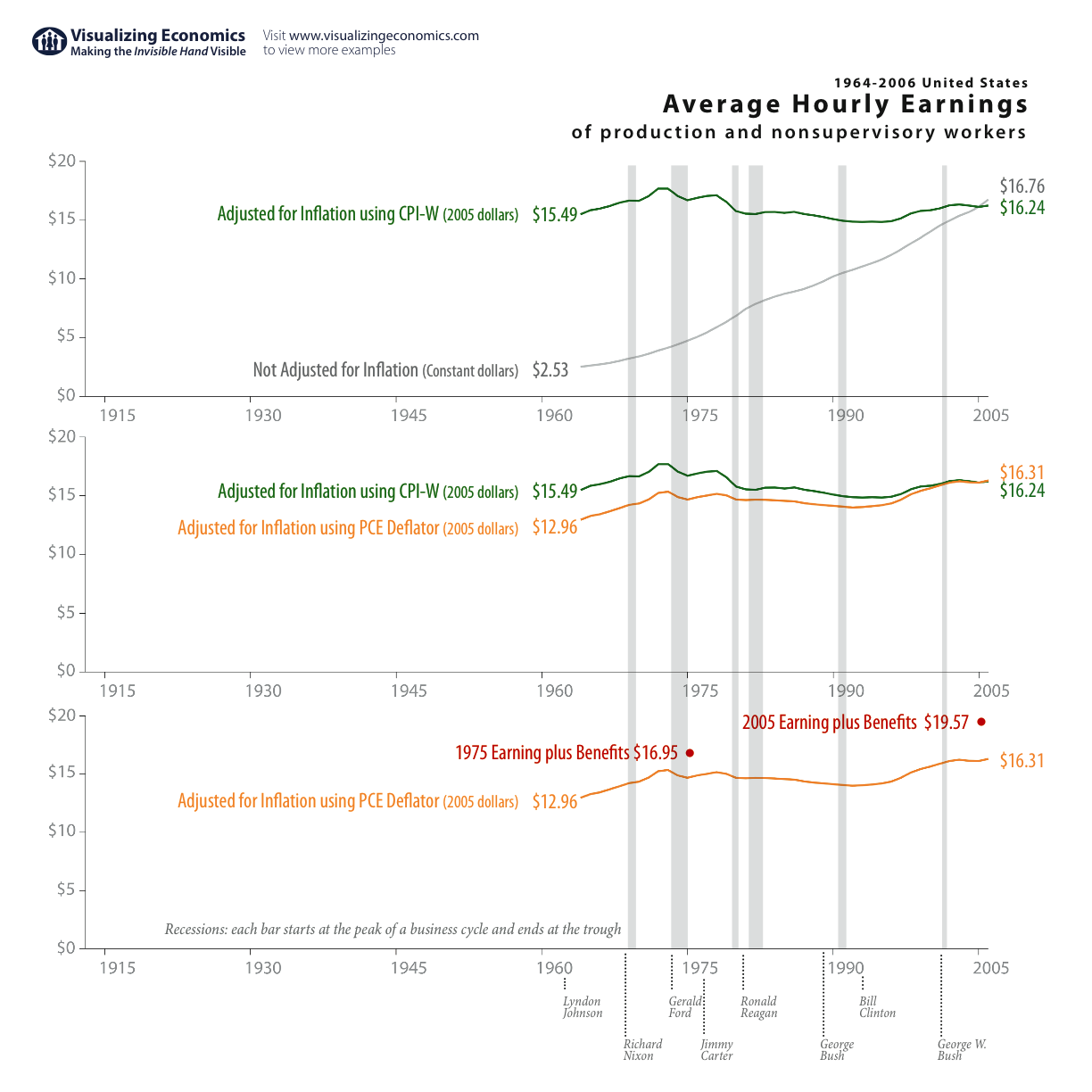
I found a Federal Reserve article that analyzed the change in Average Hourly Earnings for production and nonsupervisory workers. After adjusting for inflation using the Personal consumption expenditures (PCE) {instead of the Consumer Price Index-Urban Wage Earners and Clerical Workers (CPI-W)} and including an estimate for worker's benefits, the author concluded that workers' hourly earnings (wages plus benefits) actually increased by 16% over 30 years (1975-2005) rather than decreased. Here, I graphed the full history, 1964-2006, but used the approach laid out in the article to show the effect of inflation and benefits. BTW, if you earned $16.76 an hour in 2006 that gave you an annual income of $33,520 (assuming you worked full-time).

See also:Average Income in the United StatesTotal Income of Top, Middle, & Bottom

Addendum: This was passed on to me from a reader who found it on Marginal Revolution

Related Posts Plugin for WordPress, Blogger...