Mastodon

Histogram

Government Salaries in Texas

From a very interesting database of Texas Government Employee Salaries run by The Texas Tribune, I created three data graphics for An Illustrated Guide of Income in the United States showing their distribution (pages 92–94).

I start with graphing the distribution of all public employee salaries below $250,000, 99.7% of all state employees, listing the most common job titles I found: teachers and professors, police officers, clerks and administrative assistants, bus operators, child protective services specialist and mental retardation assistants.

However, to graph the long tail of the income distribution I have to graph individual salaries. Many are heads of surgery departments and head coaches. The highest salary goes to the head football coach at the University of Texas at Austin. (Salary of $2.5 million plus a bonuses of $2.7 million for a total of $5.2 million)

Another way to show how much inequality exists with these salaries is to plot the cumulative share of Texas public employees vs cumulative share of their salaries. But how does this compare to the Untied States as a whole?  I found in a report from the CBO, a graph plotting the 2007 cumulative share of all US households against household income which I used as a stand in for everyone in the US. You can see that the US household income distribution is more unequal than salaries of Texas state employees.

Graphs created in OmniGraphSketcher and annotated in Illustrator. 

Data sources: The Texas Tribune and the Congressional Budget Office 

Design notes: Graphs were created using OmniGraphSketcher, copied into Adobe Illustrator where annotations were added. The illustrator file was then placed into an InDesign document for the book. View all the graphics from the book online.

Related Posts Plugin for WordPress, Blogger...

2005 US Income Distribution part 3

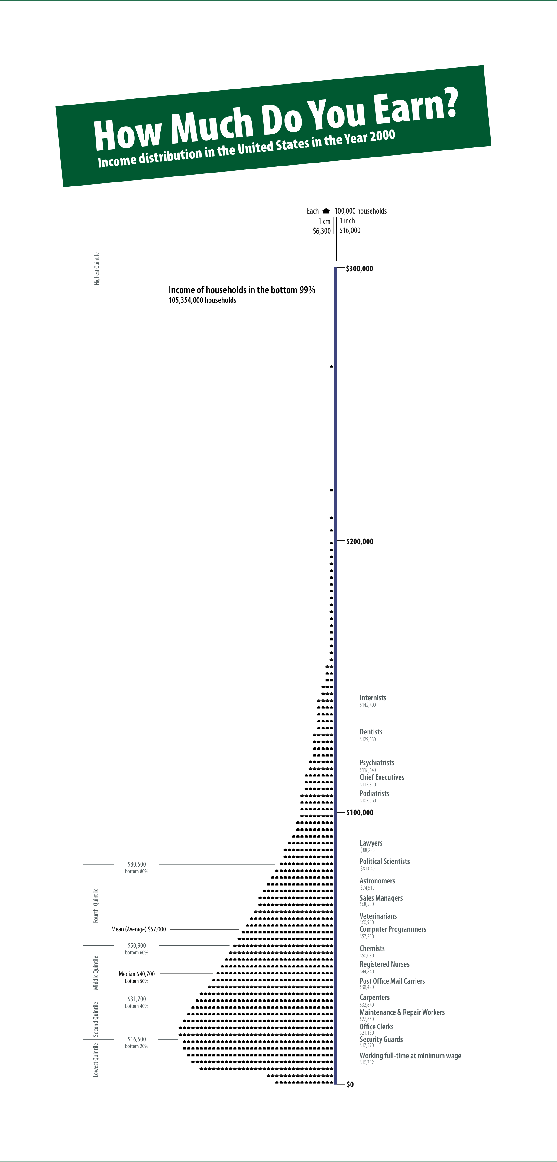
I went back to my 2005 US Income Distribution graph but this time I looked at the income of everyone above $250,000. Although one can find lists of high income earners it is very difficult to find a graph plotting their earnings as compared to everyone else. The scale of the graph is so extreme that most of the population ends up looking like a dot at the bottom of the graph. Below I have created 3 graphs that try to show the relationship between the bottom 99.99% and the top 0.01%.

2005 Income Distribution Less than 5 million
2005 Income Distribution Less than 1 billion

The original Census data can be found at Table HINC-06. Income Distribution to $250,000 or More for Households

The bottom 99.99% I estimated from data found at Emmanuel Saez's web site

The CEO and Celebrity income estimates came from Forbes magazine

And finally the income for the top hedge fund managers was first published at Alpha magazine but I found it via the New York Times

See Also: Part 1 and Part 2 

Related Posts Plugin for WordPress, Blogger...

2005 US Income Distribution

US Income Distribution 2005

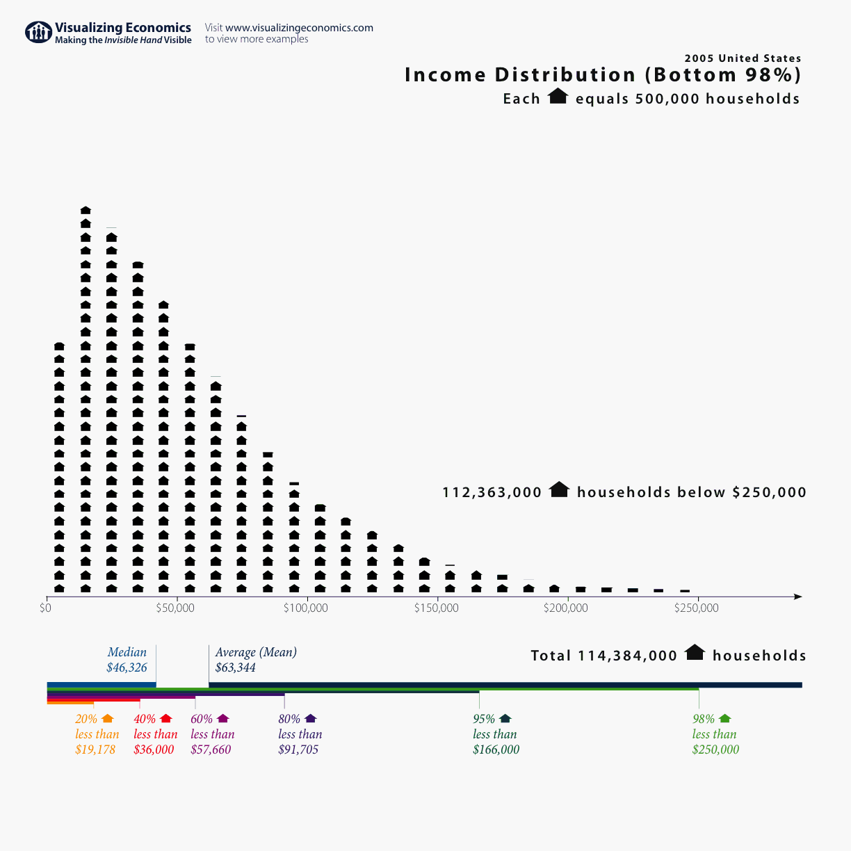
More Census data! This time it is the U.S. income distribution for 2005 showing the number of households up to $250,000. (I have since added more graphs that include incomes above $250,000: 2005 US Income Distribution Part 2 and 2005 US Income Distribution Part 3) {Click on the graph to take a closer look}

While the original Census data can be found in U.S. Census Bureau's Current Population Survey Table HINC-06. Income Distribution to $250,000 or More for Households I needed to calculate the number of households in $10,000 increments for this graph. (That calculation can be found here: Census household income distribution. Besides the income distribution for 2005, I added 2004 as a bonus. It can be viewed by anyone with a Google Account.) See Also:2005 US Income Distribution Part 2 and 2005 US Income Distribution Part 3 for graphs of the rich and super rich. And United States' Average Income since 1913 both with and without capital gains. Addendum: 11/19/2006 Added upper limits of income quintiles and the median from Table H-1. Income Limits for Each Fifth and Top 5 Percent of Households [tags]US Income Distribution, Income Distribution, Census Income Distribution[/tags]

Related Posts Plugin for WordPress, Blogger...