Mastodon

IRS

Number of corporations has dropped since the 1980s

Share of business returns filed by C corporations has dropped 16.6% to 4.9% 1980-2012 with sole proprietorships filing the majority of business returns. At the same time, the net income reported by C corporations has dropped since 1980 from 68.0% to 37.1% in 2012.

A simple matrix of business structures and Pass-Through Businesses: Data and Policy provide more information but one thing you need to know is:

The majority of companies in the United States are pass-through businesses. These businesses are not subject to the corporate income tax; instead, their income is reported on their owners’ tax returns and subject to the individual income tax.

Data Source: IRS https://www.irs.gov/uac/soi-tax-stats-integrated-business-data Table 1: Selected financial data on businesses. 

Related Posts Plugin for WordPress, Blogger...

Volatility of the Highest US Incomes

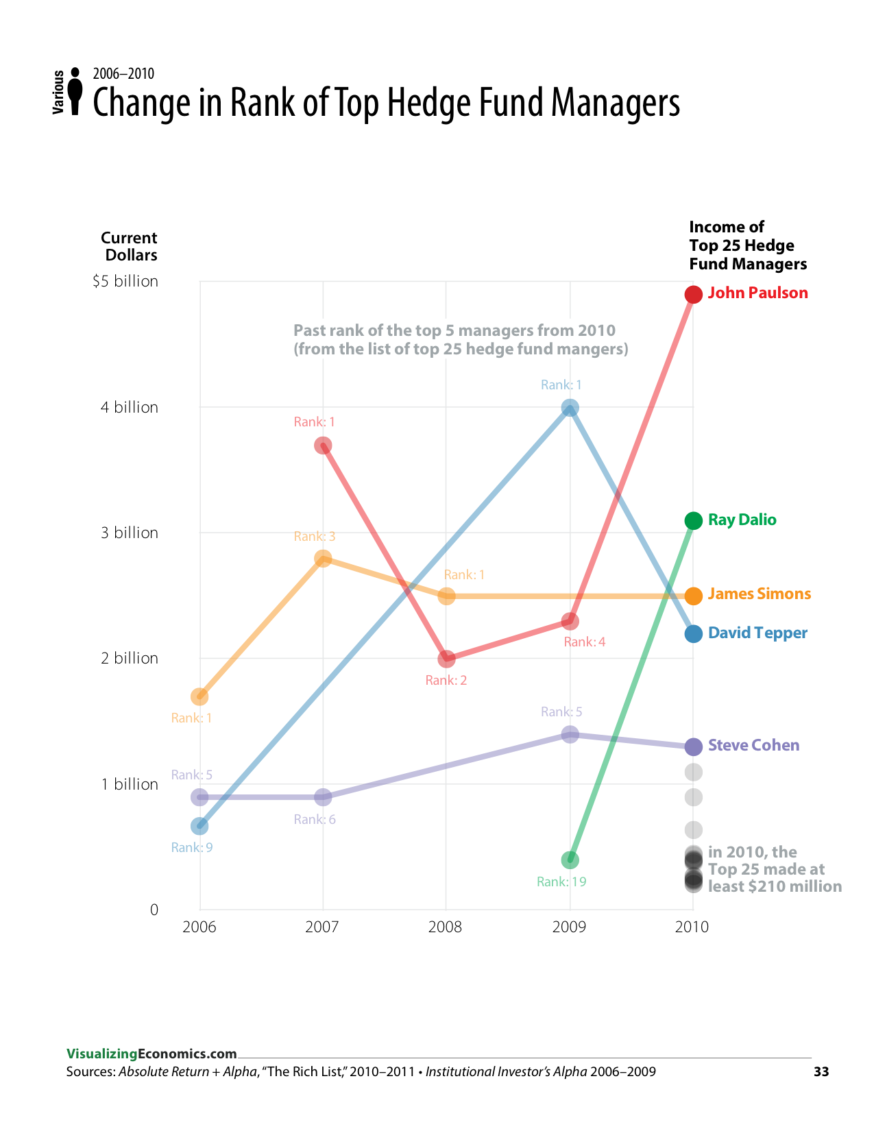
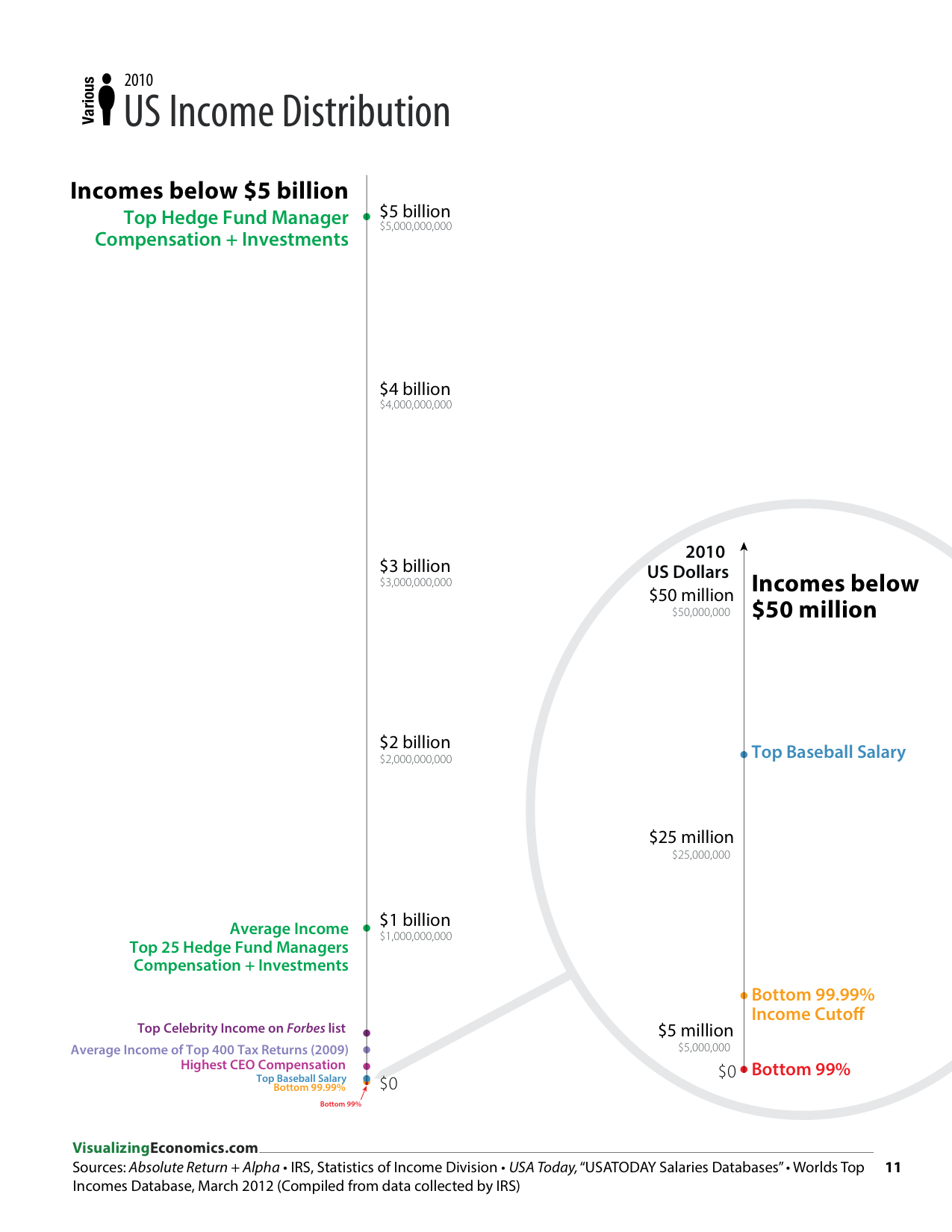
For my book, I create a set of graphs that show the extreme volatility of very highest incomes over the past 10 years. Most of the data comes from the IRS directly or from IRS data collected and analyzed by Saez and Piketty for the World Top Incomes Database. However, there is a set of statistics focused on hedge fund managers that has been collected over the years by AR: Absolute Returns + Alpha that show, what I believe to be, the highest incomes in the United States.

Line graphs were create in OmniGraphSkecher and annotated in Adobe Illustrator.


Related Posts Plugin for WordPress, Blogger...

Four Ways to Visualize US Income Inquality

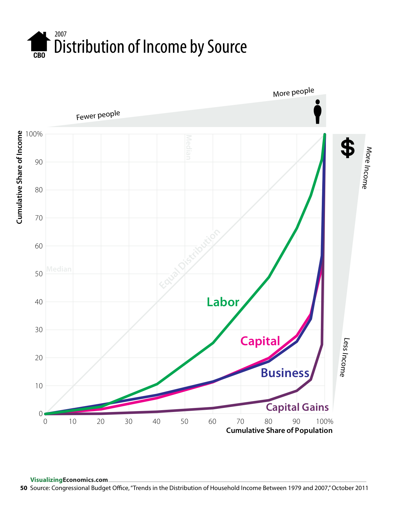
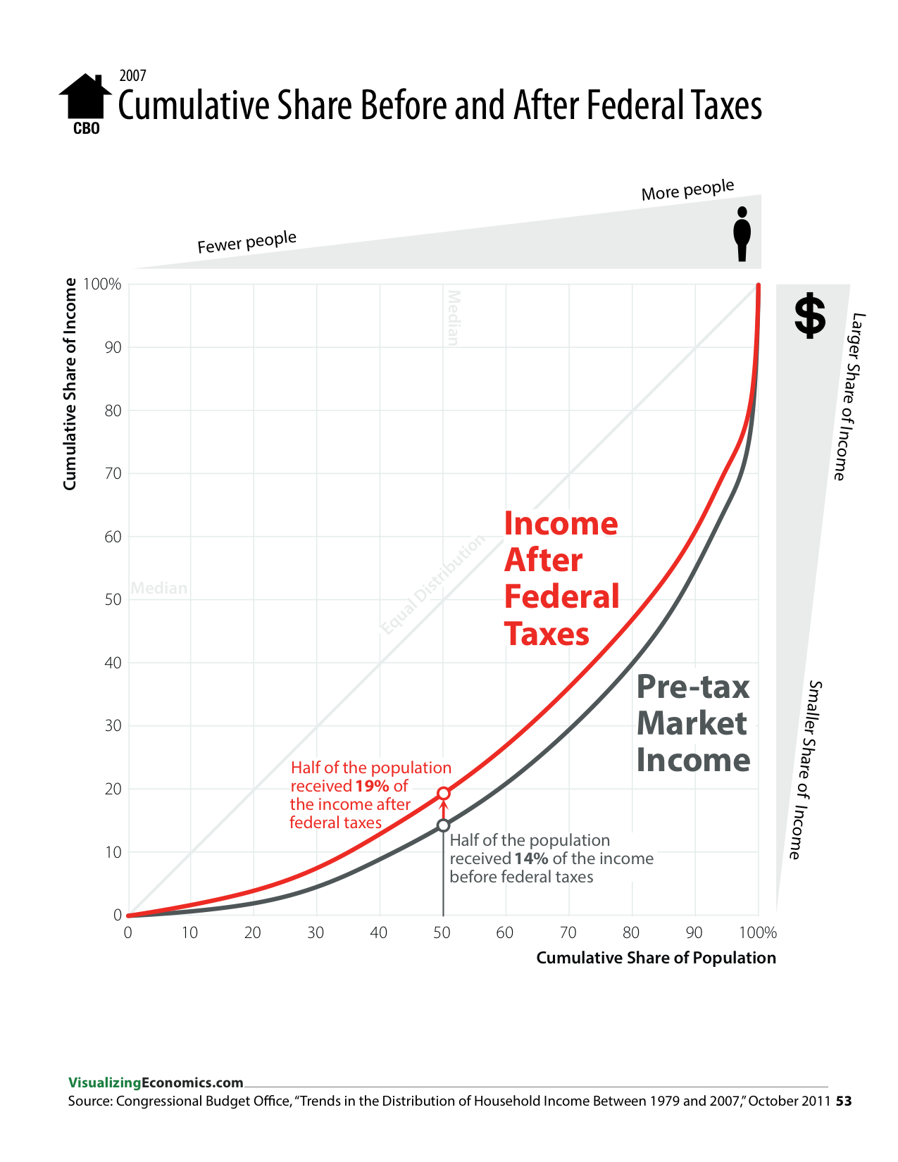
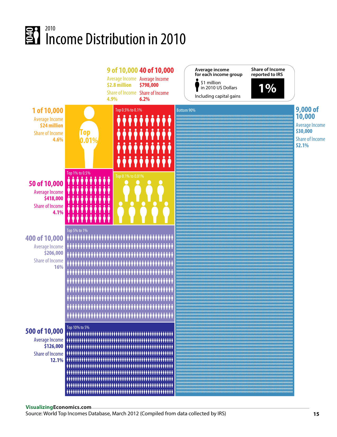
During the course of making my book, I tried to solve the problem of representing the extreme income inequality in the United States using several different graphic approaches. In some cases, I was working with a single data set like The World Top Incomes Database or the Congressional Budget Office. In others graphics, I combined this data with data from Forbes, IRS, and AR: Absolute Returns + Alpha.

Treemap was created using R and the people icons were added in Illustrator, while the cumulative share graphs and the dot plots were create in OmniGraphSkecher.


Related Posts Plugin for WordPress, Blogger...

Comparing Income, Corporate, Capital Gains Tax Rates: 1916-2011

Due to popular demand, I have updated my 2010 graph on top marginal tax rates. In addition, during this year's tax season, I will be selling copies of my Top Marginal Tax Rates graph as a tabloid size 11"x17" poster.  

FYI, your marginal tax rate is the rate you pay on the "last dollar" you earn; but when you view the taxes you paid as a percentage of your income, your effective tax rate is less than your marginal rate, especially after you take into account the deductions and exemptions, i.e. income that is not subject to any tax.

Tax Data: Married filing jointlyCapital Gains & Regular,Historical CorporateCorporate Tax Schedule (page 16) pdf

Related Posts Plugin for WordPress, Blogger...

Comparing Marginal Tax Rates Including Payroll Taxes: 2009

Updated April 13, 2010:  I don't think my original labels were clear so I tried to fix it with new labels and I reorder the graphs. This is a new infographic illustrating the marginal federal tax rate applied to different salaries. It shows the difference between the combined rate levied on an employee (Income + SSN + Medicare marginal tax rate) and the additional rate levied on the employer, i.e. the payroll tax (SSN + Medicare tax) I am using the same examples that I created in the previous six graphics looking at the average tax rate.

Related Posts Plugin for WordPress, Blogger...