See last week's post for the log scale verison. Data Source: Measuring Worth | Made with GraphSketcher & Illustrator.
BTW, if you want learn more about how I do what I do, pledge on Patreon and get a behind-the-scenes peek every month.
See last week's post for the log scale verison. Data Source: Measuring Worth | Made with GraphSketcher & Illustrator.
BTW, if you want learn more about how I do what I do, pledge on Patreon and get a behind-the-scenes peek every month.

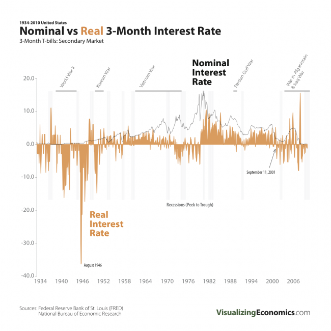
An update of my Nominal vs Real 3-Month Interest Rate graph through 2010.
Data for 3-Month Treasury Bill: Secondary Market Rate (TB3MS) and CPI-U (CPIAUCNS) from Federal Reserve Bank of St. Louis. Recessions dates can be found at NBER
Another infographic comparing the last 18 months to the Great Depression. This time I am focusing on Prices, Inflation and Deflation.

Data from Bureau of Labor Statistics: Consumer Price Index History Table
If you want more see Inflation and Deflation created by WallStats
I have plotted the 3-Month T-bills: Secondary Market rate (green line) vs the inflation adjusted (i.e. Real) 3-Month T-bills rate (orange) from Jan 1934-Sept 2008. The inflation number I used is CPI-U 3-month % change multiplied by 4.

I have plotted the annual inflation (CPI-U) vs unemployment. The green line represents the time Thomas B. McCabe was the Fed Chairman (April 15, 1948 – April 2, 1951). The gray line represent the years 1948-2007.
In traditional economic theory, the Phillips curve describes the inverse relationship between inflation and unemployment, i.e. when inflation is high, unemployment is low. This was true in the United States in the 60s but not other time periods
{Click on the image to take a closer look}

![]()
Data from Bureau of Labor Statistics
[tags]United States, Inflation, Unemployment[/tags]