Mastodon

Job Growth

Job Growth by Industry

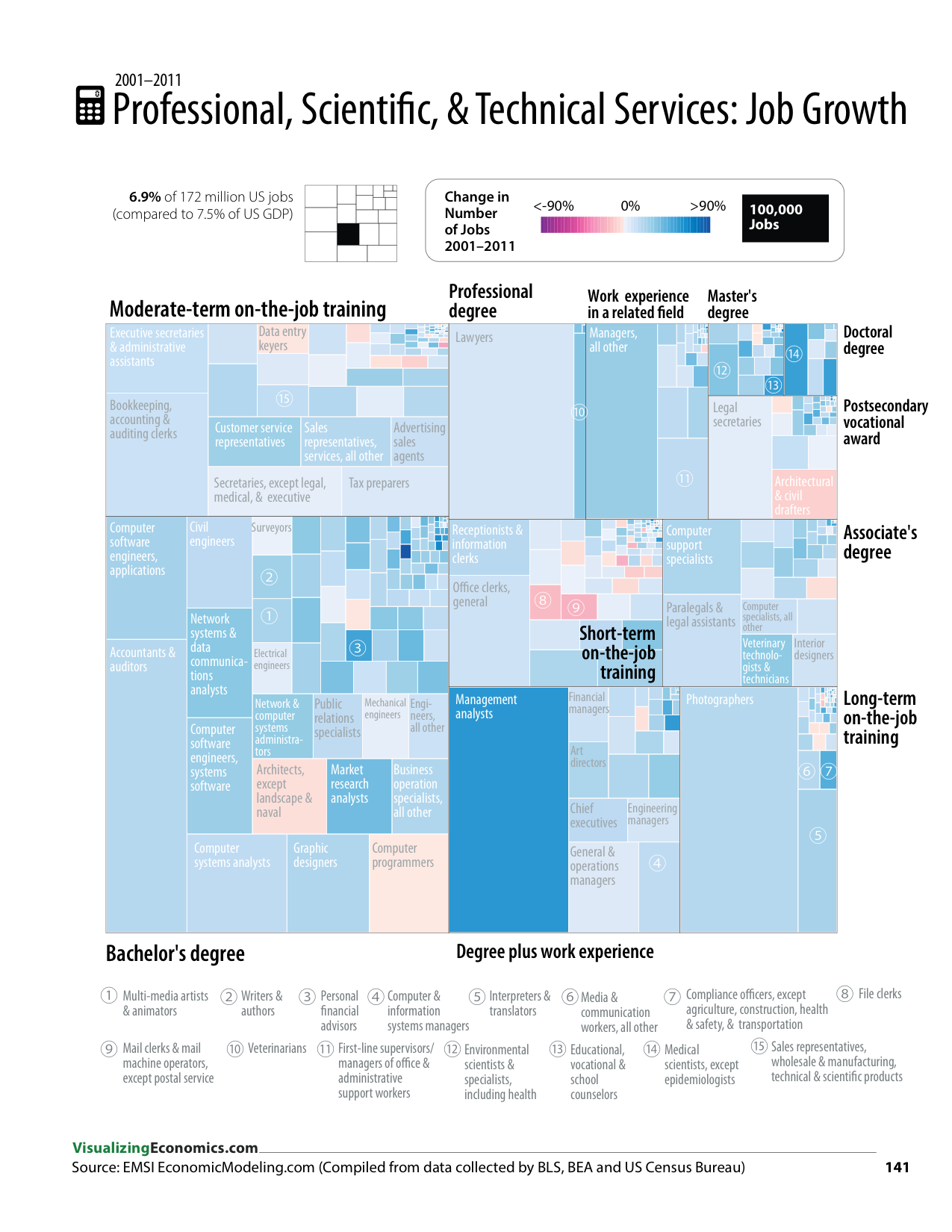
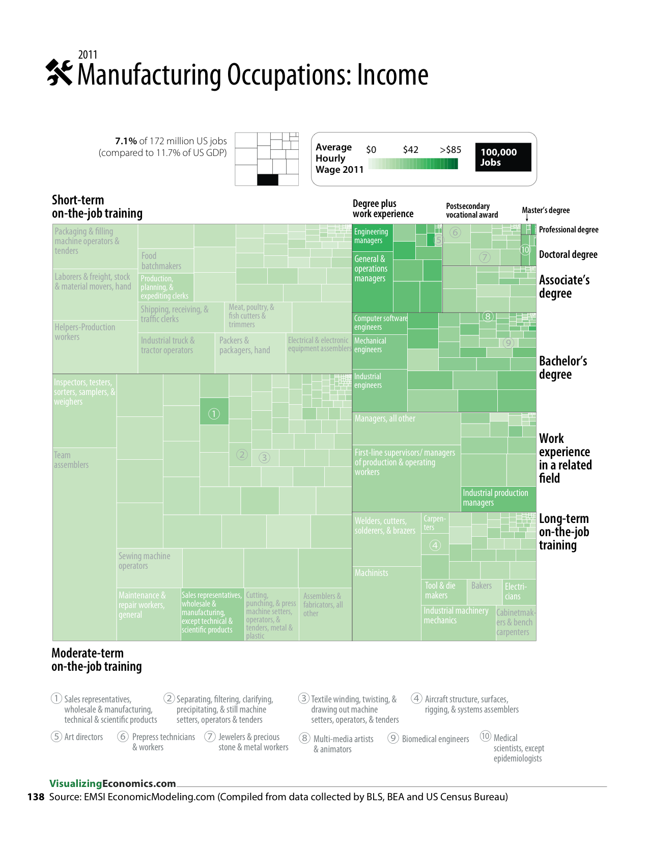
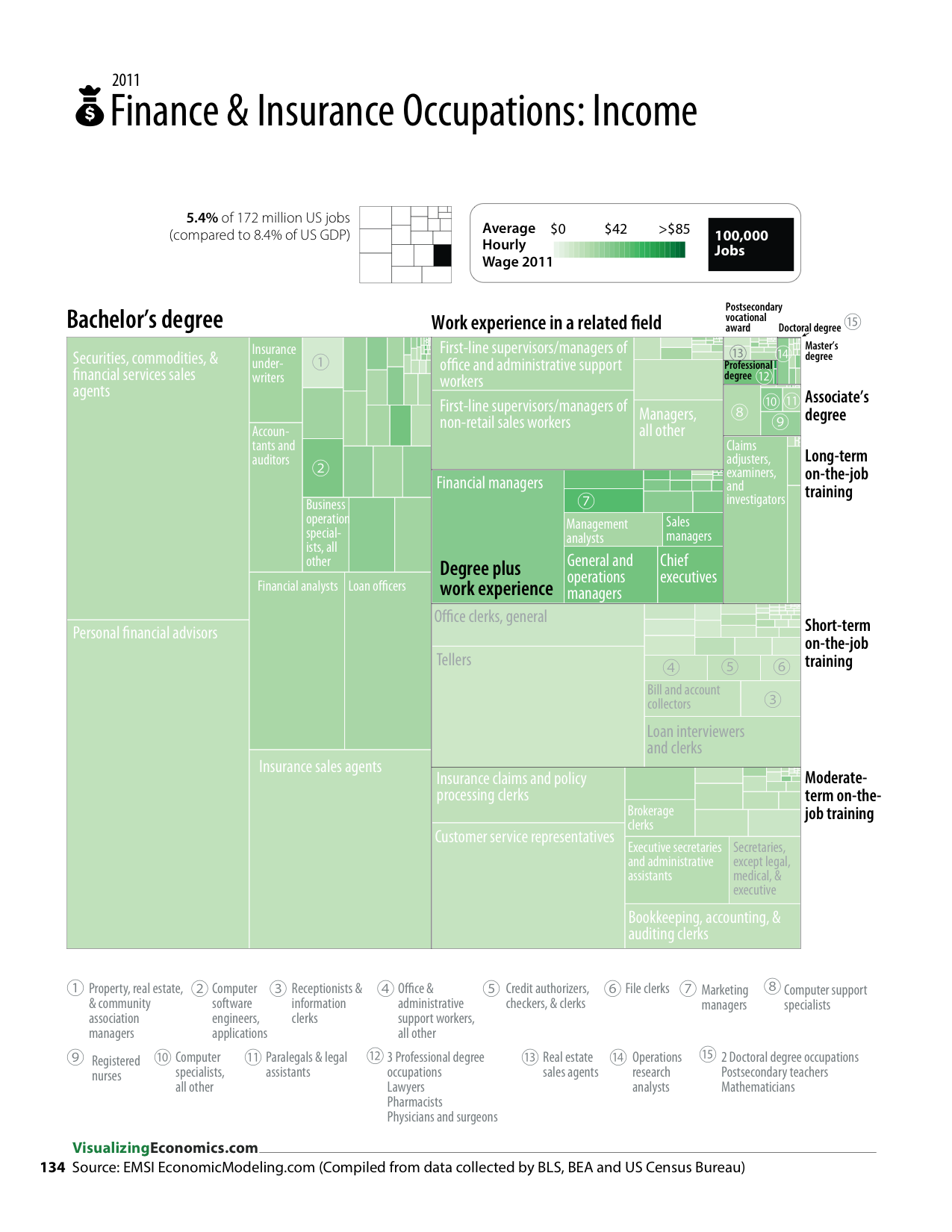
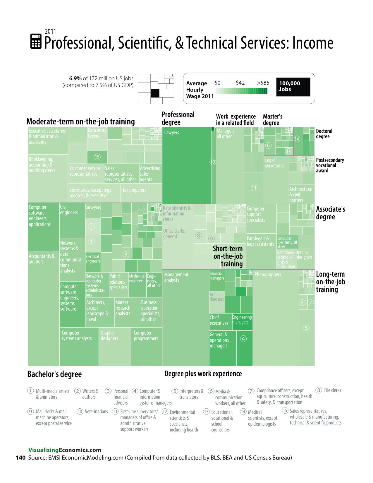
From An Illustrated Guide to Income in the United States

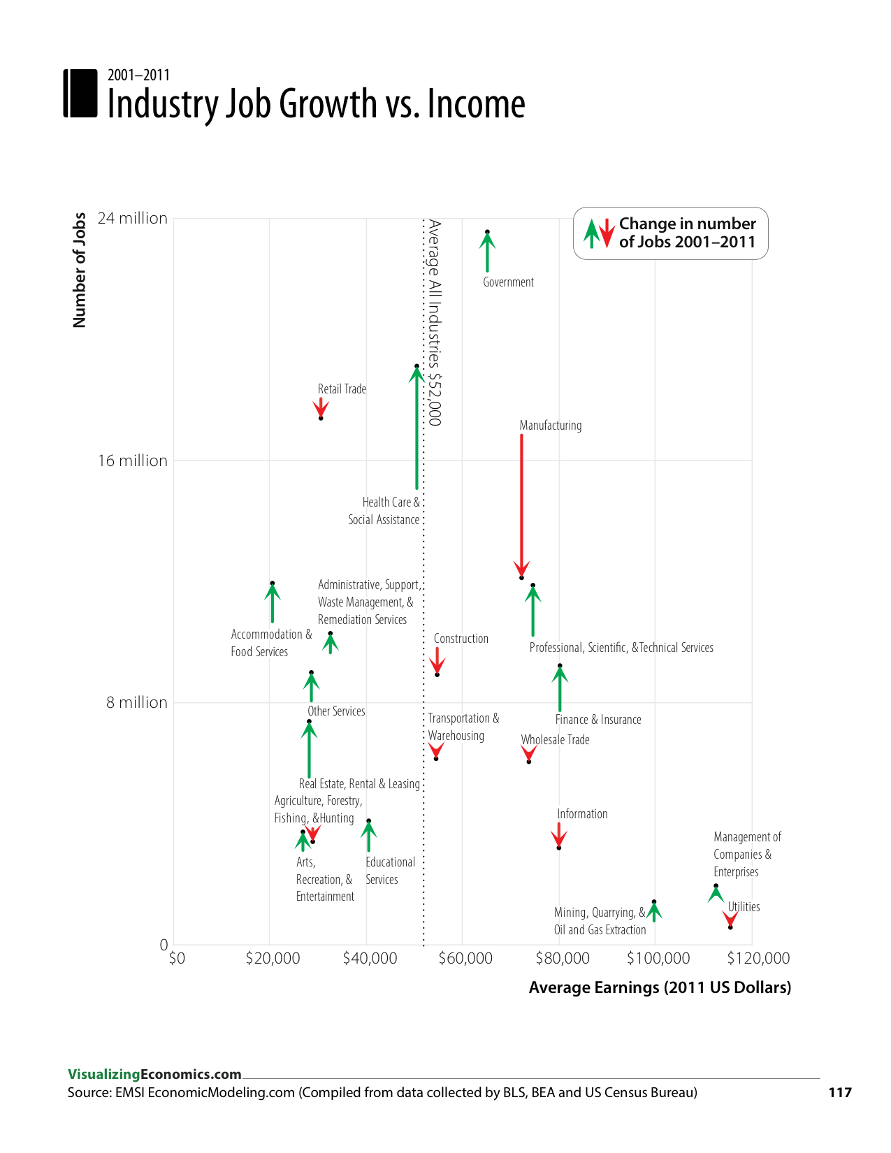
For each industry, I plotted the 10-year growth in jobs against the their 2011 average earnings*.  The drop in Manufacturing sector is very dramatic, but  notice, there are several sectors with higher average earnings than Manufacturing that saw their number of jobs increase (like Finance & Insurance). However, all of these sectors had significantly fewer jobs in 2001 compared to Manufacturing. These higher earning sectors (like Professional, Scientific and Technical Service) are dominated by jobs that require more education than most of the Manufacturing jobs. It is important to note, that today, not all of the jobs in Manufacturing are high paying jobs; even in this sector you find the highest paying jobs requiring a post-secondary degree). BTW, take a look at the wages of US Production Workers back 200 years for comparison to the recent trends.

*Average Earnings is calculated by EMSI from wages, salaries, and proprietor earnings for pensions, insurance plans, profit-sharing plans, retirement plans, compensation plans, and supplemental unemployment benefit plans, as well as employer contributions to government social insurance. 

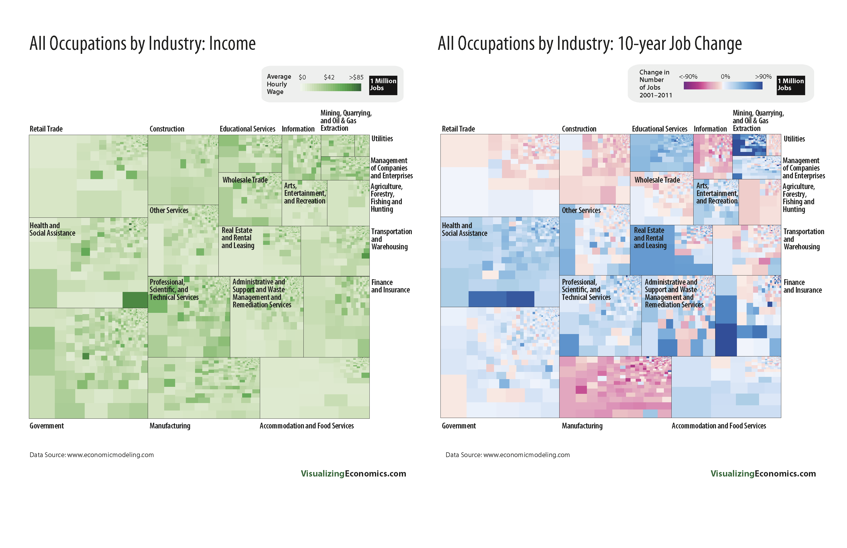
Read Online to view all to the graphics from my book about change in jobs by industry. 

Graph created using OmniGraphSketcher and Adobe Illustrator. Data from EMSI (Economic Modeling Specialists International). Summer–Winter 2011. http://www.economicmodeling.com/ 

Related Posts Plugin for WordPress, Blogger...

Ten Years of Job Loss in the "Information" Industry

Let me begin with a disclaimer. This industry includes firms that are pure internet-based activities, like hosting and web searches as well as ones that are being disrupted by the internet like newspapers and broadcasting.

Information Industry's share of GDP 1947-2010 

Starting with the Information industry's share of GDP (from page 119 of my book), while it has grown over the last 50 years it is still around 4% of GDP as of 2010. 

However, the Information industry represents only 2% of the 170 million jobs in the US economy. 


In this treemap of all occupations in the US economy, each occupation is represented by a rectangle, the bigger it is the more jobs it has. Look at the upper right corner to see Information's share of jobs. The dark red represents the percentage of jobs loss and the only area more red than the Information sector is Manufacturing.

Now drilling into just the Information industry, some of the bigger occupations are: editors, computer software engineers, customer service representatives, telecommunications equipment installers, reporters and finally producers & directors. Out of that list only producers & directors had job growth between 2001-2011. 

If you are interested in the income of these occupations or want to explore additional industries take a look at my book

Data used in these graphics was based on BLS Occupational Handbook (provided by 
EMSIand value-added GDP from the BEA.  The area graph was created in Omnigraphsketcher and the treemaps by R. Label were later added using Illustrator.

Related Posts Plugin for WordPress, Blogger...

Finding Good Jobs Without a Degree

First, what do I mean by good job? Well-paid? High level of job satisfaction? Lots of job security?

From heteconomist: Why so many jobs are crappy

Satisfying jobs – let's call them 'good jobs' – will generally be ones where learning occurs at a steady pace more or less indefinitely, probably as part of a defined career path. [...] Once you gain experience in a good job, you will soon become much more efficient in the role than an inexperienced replacement would be.

Summarizing this post, MarginalRevolution comments

The first key point is that if you learn more on the job on a regular basis (i.e., your job is interesting), you become harder to replace from the point of view of your boss.  Over time you win more of the bargaining surplus. 

So looking at my treemaps of occupations from An Illustrated Guide to Income in the United States, I have a category called "Long-term on-the-job training" defined as:

More than 12 months of on-the-job training or, alternatively, combined work experience and formal classroom instruction, are needed for workers to develop the skills to attain competency. Training is occupation specific rather than job specific; therefore, skills learned can be transferred to another job in the same occupation. This on-the-job training category also includes employer-sponsored training programs.

This sound like some of the "good jobs" people are looking for that don't require a college degree.

​Click on images to enlarge.

WIth this data graphic, I wanted to give an overview of all occupations grouped by the education/training required. The size of each rectangle represents the number of jobs.

Occupations like: electricians, carpenters, farmers & ranchers, restaurant cooks, photographers, police & sheriff's patrol offices can be found in  "Long-term on-the-job training".

The last three occupations (restaurants cooks, photographers, police & sheriff's patrol offices) increased in number of jobs from 2001-2011.

To learn more about which industries have a high number of  "long-term on-the-job training" jobs, first check out pages 128-148 in my book and then goto the BLS's Occupational Handbook to search for more jobs with long-term on-the-job training but no college requirement.

Data for the occupation treemaps was provide by EMSI based on data from Bureau of Labor Statistics (BLS).

Related Posts Plugin for WordPress, Blogger...

Comparing Income & 10-year Job Growth for All Occupations

Here is a sneak peek at my An Illustrated Guide to Income in the United States. These are a set of data graphics looking at the average income and change in number of jobs over the last ten years for 800+ occupation by industry and by education. Be sure to sign up to be notified when the Income Guide is done. 

Data from EMSI

Related Posts Plugin for WordPress, Blogger...