

Thesis Project
The following posters illustrate some basic facts about the U.S. economy: how rich is the United States?, what is the distribution of income in the United States?, and what does the Gross Domestic Product (GDP) really measure? All of the economic data is available in public sources on the Internet.
How Much Do You Earn?

People talk about the average family income in the U.S. (around $50,000-a-year), referring to the mean income in the United States. But in political discussions, the average family often becomes the "typical American family" (especially during election years). As you can see from my poster illustrating the distribution of income in 2000, when it comes to annual income there is no such thing as a typical family. Data is from the Census Bureau, IRS, and Congressional Budget Office.
How Rich is the United States?
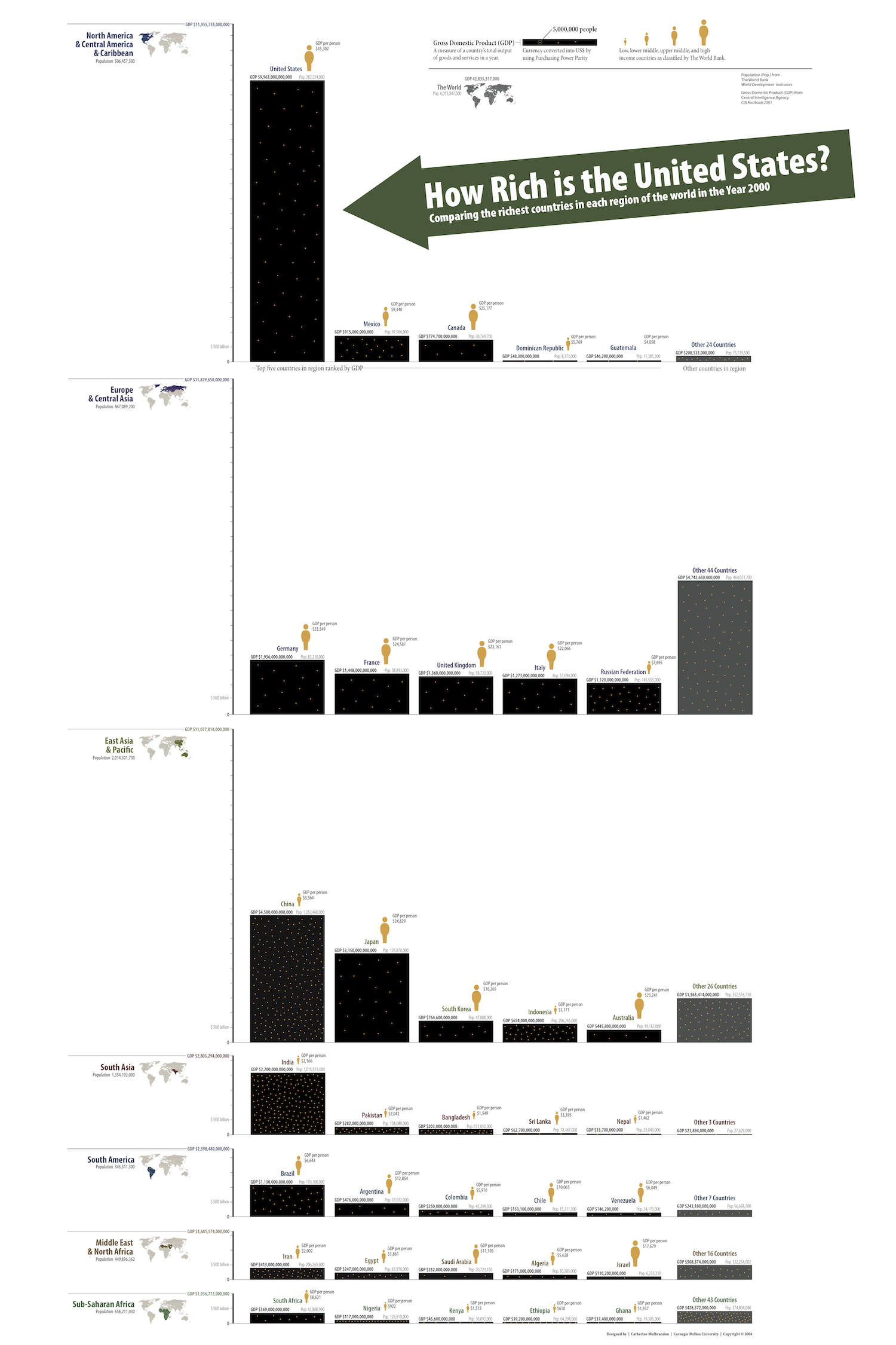
The United States is a rich country but how rich is it? What you will commonly see presented is a bar graph showing the top ten countries by GDP. I took a different approach by creating a graph showing the top five countries in each region in the world. While the top ten countries are represented, you can compare them to their neighbors. This layout will include countries from poorer regions of the world in contrast to the wealthier ones. I also added each country's population since one country may have a greater GDP than another but because of its greater population, that country's citizens are much poorer. The data is from the CIA and The World Bank.
How Can You Measure a Nation's Wealth?

What is GDP? You hear it discussed in the news but the definition given is rarely more detailed than measuring the goods and services produced in a country. In this poster, I tackled this question by looking at the GDP of the U.S. broken out into different industries: agriculture, manufacture, construction, etc... I felt this was an intuitive way to look at a country's GDP. At the same time, I talk about different methodologies for measuring the GDP. The data is from the Bureau of Economic Analysis and The World Bank.
Thesis Essay
The discussion of economics in the media can be confusing and contradictory. Often numbers are quoted out of context, while political agendas distort the presentation of economic data. At the same time, the visualization of economic data has become more common, although reporters and editors regularly fall back on conventional methods to present this information. However, some attempts by graphic designers to add visual interest to these graphics end up distracting from, rather than revealing the data’s significance. I will be using economic stories in the media to explore the role of visualization in persuasive communication by employing the work of several authors including, Chaim Perelman’s The Realm of Rhetoric and Jacques Bertin’s Semiology of Graphics. My purpose is to understand how a designer shapes an argument while maintaining the integrity of economic data in its visual representation.
CREATIVE COMMONS LICENSE
I have posted my work online under a CREATIVE COMMONS BY-NC license for you:
to Share — to copy, distribute and transmit the work
to Remix — to adapt the work
Noncommercial — You may not use this work for commercial purposes.
If you do use my work all I ask is that you attribute the work to me: Created by Catherine Mulbrandon at VisualizingEconomics.com and send me some new fans. If you have any questions feel free to contact me.