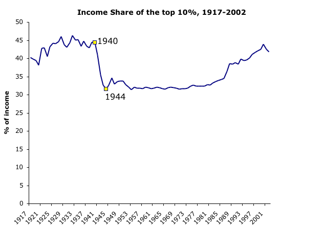
This income data is from an academic paper "Income Inequality in the United States, 1913-1998" by Saez and Piketty. It is the longest history that I have found so far and it focuses on high-income "tax units", i.e. IRS income data of the wealthy. The U-shape of this graph was a little startling as was the dramatic drop in income during World War II.

